Tag Archives: jewelry

Action!


Jackson Pollock - photo by Hans Namuth

Jackson Pollock – photo by Hans Namuth

Lately I have felt the need to reconnect with less traditional techniques, and to be a bit more spontaneous in my approach. In my “side-gig” as an art history instructor in our Jewellery Programme, I had been looking at the work of the Abstract Expressionists, namely Jackson Pollock. The photographs and film of the painter shot by Hans Namuth in the early ‘50s show Pollock at work. In these iconic images, Pollock is seen moving about the large canvas laid on the floor, leaping and dripping or throwing paint right from the can. He appears to be totally immersed in the act of painting, an intense, gestural process; at some point, saying: “A painting has a life of its own; I let it live”. I watched this clip over and over again and knew that I wanted to work in a more instinctive manner, to respond to the metal as it moves and shifts, to be more engaged with it. I needed to put the “action” back into my work. I should also mention the paint-splattered shoes and the dangling cigarette, oooh, so cool. I wanted that too, or whatever the equivalent is for a goldsmith (minus the cigarette, of course).

Jackson Pollock - photo by Rudy Burckardt, 1950 - Smithonian Institution

Jackson Pollock – photo by Rudy Burckardt, 1950 – Smithonian Institution

Taking Pollock and the Action Painters, and their direct and immediate approach to painting as a point of departure, I decided to tackle a series of brooches (brooches, being less constraining and offering a larger “canvas” so to speak). I would riff on a few abstract shapes and create three-dimensional forms based on them. Copper, a very ductile and malleable metal, was the perfect candidate. It also lends itself well to patinas and will take on rich colours, sometimes even quite painterly.


Detail of patina on corrugated copper.

Detail of patina on corrugated copper.


Bonny Doon Engineering micro-fold brake #115090

Bonny Doon Engineering micro-fold brake #115090

Using corrugation and fold-forming, techniques that are fairly quick and hands-on, I was able to shape the sheets of metal rapidly, in a gestural and energetic manner. I recommend Patricia McAleer’s book Metal Corrugation, Surface Embellishment and Element Formation for the Metalsmith, 2002, Out of the Blue Studio (ISBN: 0-9715242-0-3), a very thorough and handy manual on corrugation. Fold-forming, a technique developed by Charles Lewton-Brain (several excellent publications available, see: Brain Press Publications) is a process that is both technical and playful, where the material is folded and unfolded repeatedly to form three-dimensional structures. Both techniques only require a few tools and simple equipment. For corrugation, I used the Bonny Doon Engineering micro-fold brake #115090 (available at riogrande.com). Fold-forming does not require any special equipment other than a rolling mill. Free tutorials are available on ganoksin.com.


D.Brechault, Crane No 6. copper, heat patina; corrugation, fold-forming

D.Brechault, Crane No. 6, brooch, copper, heat patina; corrugation, fold-forming


D. Brechault, Pod No 3, brooch, copper, heat patina; corrugation, fold-forming.

D. Brechault, Pod No. 3, brooch, copper, heat patina; corrugation, fold-forming.

D. Brechault, Zip No. 5, brooch, copper, heat patina,; corrugation, fold-forming.

D. Brechault, Zip No. 5, brooch, copper, heat patina; corrugation, fold-forming.

So, this is what I have been doing so far: These brooches are a sampling of a series of impromptu sketches or studies in metal. Rather than cleaning the metal by pickling it after annealing and soldering, I have left it in its natural state, oxidised, covered with a patina of warm, earthy colours. For me, this is a bit like Pollock’s paint-splattered shoes – evidence of the process of working the metal.

Rolling, folding, unfolding, shaping. Action!

Pollock's shoes - photo courtesy Pollock - Krasner House & Study Center.

Pollock’s shoes – photo courtesy Pollock – Krasner House & Study Center.

Acknowledgements: Thank you for your research, Andrew!


The I Ching of the Goldsmith

Hexagram Qian: "Force", also: "The Creative Heaven", from the I Ching.  From top: mandrel, hand forged setting tool, dapping punch, square needle file, hand forged setting tool, hand forged repoussé tool

Hexagram Qian: “Force”, also: “The Creative Heaven”, from the I Ching.
From top: mandrel, hand forged setting tool, dapping punch, square needle file, hand forged setting tool, hand forged repoussé tool

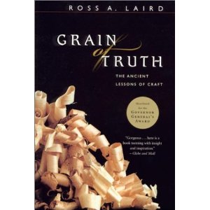
The holidays at last! Time to unwind and have fun. My idea of a good time is reading a book, and for this, I chose Grain of Truth – The Ancient Lessons of Craft, by Ross A. Laird, a book I had read and enjoyed over a decade ago. Guaranteed gratification? Yes, and why not? It is the holidays after all.

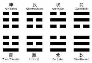
In “Grain of Truth”, the author takes us through the process of designing and making a series of woodworking projects. This is not, however, a technical manual or a how-to book (although it is kind of, but in a poetic sense). Organized in eight chapters named after the eight trigrams of the I Ching (Earth, Water, Fire, etc.), and each dedicated to a different project, it flows elegantly and seemingly without effort from chapter to chapter. We follow the maker as he experiences joy and satisfaction or doubt and frustration. And although it deals with woodworking projects, it is quite universal and will resonate with any craftsperson, whatever their craft may be.

Trigrams of the I Ching

Trigrams of the I Ching

The book celebrates the importance of craftsmanship, the beauty of an object made by hand, but not in a sentimental way because, the “truth” is, this practice demands deep awareness and strict discipline. The process of creating and making something by hand, like meditation, requires us to pause and ponder often. “Working with hand tools”, says Laird, “teaches, in a pragmatic way, the art of stillness” (p. 28). When working with wood, or any other medium for that matter, one needs to be receptive, to watch and to listen. Observe the file as it glides on the edge of the sheet of metal. Hear the hammer as it hits the metal. When under pressure or facing deadlines, how many times have I felt the impulse to dominate the tools, to force them to perform a specific task? It is not, Laird adds, about will power, which will only bring disappointment and frustration. Instead, it “requires a purposeful surrender, a willingness to be taught by tools (…)” (p. 29).

This book, so full of wisdom, shows us that patience and humility, backed by concentration and deep knowledge of materials and techniques, will be rewarded with a sense of wonder. In the spirit of the Tao, Laird always starts afresh with each project, open to the possibilities and with “faith in the process and a willingness to be taken” (p. 50).

Happy holidays and best wishes to all for a creative New Year.

Ross A. Laird, Grain of Truth – The Ancient Lessons of Craft, Macfarlane Walter & Ross, Toronto, 2001. ISBN 1-55199-065-2

51RZ9Q3QKPL__SL500_AA300_


“Beyond the Precious” (searching for beauty in all the wrong places)


Automobile Junkyard on the North Bank of the Kansas River between the 12th and 18th street bridges. Kenneth Paik, 1973. Wikimedia Commons.

Automobile Junkyard on the North Bank of the Kansas River between the 12th and 18th street bridges. Kenneth Paik, 1973. Wikimedia Commons.

A few months ago, I wrote about the challenges of reconnecting with my creative side and working on three new pieces of jewellery I intended to submit to an exhibition. This post is a behind-the-scenes glimpse into my process and these challenges. Spoiler alert! I did meet the deadline and all three pieces were accepted in the show.

The first challenge was of my own making. I wanted to make rings; my previous projects had been mostly lockets and brooches, and I needed a change. Brooches would have been a more practical choice simply because they offer more space, a larger canvas so to speak, to express myself. But most of all, because brooches are not worn directly on the body, wearability issues are less constraining.

The theme of the show, “Beyond the Precious”, resonated with me because I had just seen an exhibition of Edward Burtynsky’s photographs. His large-scale pictures of industrial sites intrigued me. Looking at these richly coloured and exquisitely detailed man-made landscapes, I wondered how it was possible that I was made to feel both awed and repelled at the same time.

Edward Burtynsky, Nickel Tailings #31, Sudbury Ontario, 1996.

Edward Burtynsky, Nickel Tailings #31, Sudbury Ontario, 1996.

What I was interested in were themes of corrosion, rust and decay. For this purpose, I would use a combination of precious and non-precious metals and play on the contrast between these materials. As well, rusted metals would introduce a variety of textures and some colour. This was quite a departure for me as my work tends to be more figurative with a narrative unfolding around some kind of personal element, such as a memory or a place. For this project, the starting point would be the materials, and the focus would be on forms and textures. It was time to rummage through my boxes of found bits and pieces, my “Cabinet of curiosities” as I like to call it (more on that in a later post, “Confessions of a Hoarder”).

A sampling of found metal objects from my "Cabinet of curiosities".

A sampling of found metal objects from my “Cabinet of curiosities”.


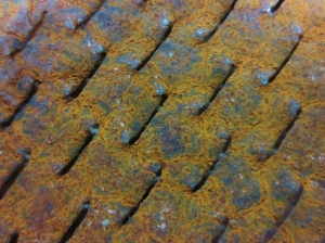
Here is what I selected: a piece of muffler, a section of metal strapping and a washer – all nicely rusted out, of course, and with tantalizing patterns and textures. I was drawn to the muffler fragment because of the pattern of small slots repeated all over its surface. The piece of strapping, with its pierced circles of alternating sizes made a strong visual statement. As for the simple washer, I thought it could serve somehow as a setting for a stone. Now, could I just let these strong shapes inform the rest of the rings? Certainly, I wasn’t going to let myself be intimidated by concerns such as wearability! On the other hand (pardon the pun), these rings had to be worn without inflicting too much pain to the wearer. The solution was to use a silver sleeve (the part through which the finger could go comfortably), and to attach the found metal pieces to it. But how would I join the rusted steel pieces to the silver component? Soldering was not an option, so it would have to be cold connections, such as rivets or staples.

Dominique Bréchault, "Spilt". Ring, 2014. Silver, synthetic stones, found washer, patina. Cast, fabricated, stamped.

Dominique Bréchault, “Spilt”. Ring, 2014. Silver, synthetic stones, found washer, patina. Cast, fabricated, stamped.

For “Spilt”, I cast the shank of the ring in silver. Thick and wide, and darkened with black patina, it accentuates the industrial feel of the piece. A dome has been soldered to the top at a slight angle, as if about to “spill” out its contents (a green tube set cubic zirconium visible through the opening of the washer). The rounded silver tabs joining the washer to the silver dome contrast with the rough rusted texture.

Dominique Bréchault, "Exhausted". Ring, 2014. Silver, found muffler part. Fabricated.

Dominique Bréchault, “Exhausted”. Ring, 2014. Silver, found muffler part. Fabricated.

“Exhausted” is a wide silver ring wrapped with a fragment of rusted muffler. As simple as that seems, the difficulty here was to bend the fragile piece of crumbling metal without breaking it, and then to attach it securely to the silver band. I soldered silver wire posts onto the ring and bent them through the slots of the muffler to hold it in place. A thick section of silver plate, with an irregular side to echo the frayed edges of the muffler, holds one end of the wrapped piece in place.

Dominique Bréchault, "(W)holed". Ring, 2014. Silver, copper, cubic zirconium, found perforated hanging strap. Fabricated.

Dominique Bréchault, “(W)holed”. Ring, 2014. Silver, copper, cubic zirconium, found perforated hanging strap. Fabricated.

In making “(W)holed”, I wanted the strapping to be the focus of the work as I felt it was so visually striking. Again, the challenge was to connect this large piece of rusted metal to the silver ring, and not only physically, but visually as well. The strapping is held in place by two thick strips of silver soldered to the shank – a tension setting of sort. Pierced holes laid out in a regular pattern on the double-layer silver ring mirror the holes in the strapping. A small white cubic zirconium lights up the deep dark rusted tones of the top of the ring.

All found metal components were sprayed with Krylon®, a clear matte sealer ideal for protecting these types of materials without being too obtrusive.

IMG_2957 (2) (1024x768)

The show is now over and, reflecting on the process of making these rings and the challenges I faced, I can appreciate how far out of my comfort zone I wandered. In fact, I am feeling quite adventurous again, so much so that I started working on a submission for another upcoming show. This time I will be making a series of brooches, and exploring new themes and materials. I will keep you posted on my “travels”.


Going Green (and Blue)

IMG_1611 (3) (1024x768)

Bleeding Heart leaves in my backyard (Jewels courtesy of Mother Nature).

We are well into spring now. Days are getting longer, trees are greening and flowers are blooming. I always find this influx of renewed energy quite contagious. It makes me want to start new projects – something “new” and fresh, something well… green of course. But I also know this surge of optimism (and over-confidence?) is usually short-lived. As the last lilacs begin to fade, so does my enthusiasm. So, let’s get to it before I surrender to a “less colourful” work routine.

There are countless options available to metalsmiths when it comes to metal patination, especially with copper and brass. In a previous post, I shared a few simple recipes for creating red patinas on copper. This time, I will focus on greens and blues. And like last time, I have chosen basic recipes that can be used easily in a small studio, with limited equipment and common household products (vinegar, ammonia and salt).

Metal preparation is key. The metal must be thoroughly cleaned (free of grease and oil) to ensure the proper action of the chemicals. Pumice works well, but scouring cleaning products like Ajax or Comet, for example, will do the job. Once the surface of the metal is clean, avoid touching it (hold by the edges or make a handle with fishing wire).

Copper is best suited for this type of patina, although brass, a copper alloy, will work up to a point with much less dramatic results. Silver is only superficially affected by this chemical reaction, so it can be used in combination with copper and provide some contrast. In the following example, the silver solder inlay stands out in a copper piece with a dark green patina.


D.Bréchault - Spring Shower. Brooch. Copper, silver solder inlay, patina.

D.Bréchault – Spring Shower. Brooch. Copper, silver solder inlay, patina.


Spraying: The simplest method for producing a blue patina on copper is to spray ammonia on the surface of the metal, and let it dry outside in the sun for a few hours. If the metal has been textured, like in this photograph, the patina settles into the recesses of the texture and highlights the pattern. The cool blue patina is offset by the warm brown of the copper in the background.


Copper with stamped texture, ammonia (sprayed on).

Copper with stamped texture, ammonia (sprayed on). Sundried (3 hours).

To produce a wider range of greens and blues with a variety of surface treatments, two main methods can be used: the fuming method and the moistened method.

Fuming method: The metal is exposed to (not immersed in) the fumes of ammonia and/or vinegar. There are two options:

With Option A, you’ll need to drill small hole in the piece to suspend it in the jar with a fishing line (not metal wire). The piece can be re-cut later and filed to remove the hole. Allow at least 3 or 4 days or even more for the patina to develop, and to obtain richer tones.

Option B is more practical for coloring larger pieces or objects that can’t be suspended. As well, since the metal can be laid flat, it is possible to sprinkle salt on the surface. The action of the salt, combined with the fuming, creates patterns that add more interest to the coloring.


OPTION A: The metal is suspended in a glass jar by a fishing line, without touching the liquid. The jar is tightly sealed.

OPTION A: The metal is suspended in a glass jar by a fishing line, without touching the liquid at the bottom of the container. The jar is tightly sealed.


OPTION B: The metal is set beside a small container filled with ammonia, and placed in a larger tightly sealed glass container.

OPTION B: The metal is set beside a small container filled with ammonia, and placed in a larger tightly sealed glass container.

Copper. Ammonia and salt. 4 days.

Copper, ammonia and salt. 4 days.


Moistened method: With the moistened method, the metal is buried in moist medium.
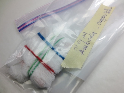
Metal wrapped in cheesecloth moistened with ammonia and tied with elastic bands, in a sealed plastic bag.

Metal wrapped in cheesecloth moistened with ammonia and tied with elastic bands, in a sealed plastic bag.

This truly fun technique allows the different mediums, moistened with ammonia or vinegar, to leave their own distinctive marks on the surface of the metal – this “etched” texture adds depth to the patina. The only drawback is the length of time it takes to achieve a rich colour, usually several days, a week or even longer. During this time it is important not to handle the piece, which would interfere with the process. But your patience will be rewarded!


Copper, ammonia, cheesecloth. 8 days.

Copper, ammonia, cheesecloth. 8 days.

Wrapping cheesecloth around the metal and attaching it with elastic bands creates a simple tie dye pattern:

Copper, cheesecloth tied with elastic bands. 8 days.

Copper, ammonia, cheesecloth tied with elastic bands. 8 days.

Cheesecloth, dried grasses, tobacco leaves, tea, wood shavings, cat litter (clay granules, wood or paper pellets – without additives), etc… each material will create a different “etched” pattern and rich shades of green or blue. Try experimenting with several mediums. The possibilities are endless, as long as the material is dry and absorbent enough, and untreated. For better results, the key is not to add too much liquid to the medium; it should be moist, not wet.


Copper, ammonia, cat litter (clay granules), 1 week.

Copper, ammonia, cat litter (clay granules), 1 week.

Generally, ammonia tends to produce more blues, vinegar, more greens, but results are not always easy to control as many variables can affect the outcome. The main factors: length of exposure, quantity of chemicals used, will make a difference, but there are other ones such as the type of medium, the shape of the object, the gauge of the metal used, the composition of the metal (for brass) and the temperature, that are not always easy to manage. Don’t forget to document your experiments. Keep samples and take detailed notes to be able to reproduce the colours you like.

Finishing: Pieces of jewellery with this type of patina should not be worn directly on the skin. Beeswax or a spray coating/fixative like Krylon can be used to seal and protect the surface of the coloured metal. Left unprotected, some of these patinas will continue to evolve:
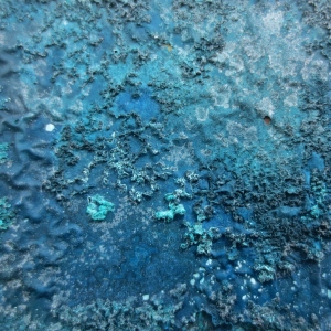
Copper, ammonia (fuming method). Unprotected surface.

Copper, ammonia (fuming method). Unprotected surface.

What I love about these techniques, beside the rich colours and painterly effects they offer, is that there is no right or wrong, as long as you keep your mind open to possibilities and happy accidents. Have fun with this, and who knows, this might help you sustain those boosts of spring energy and keep you motivated during the dog days of summer.

Recommended reading:

Patinas for Small Studios, by Charles Lewton-Brain, Brain Press, 2007.

Tips from the Jeweller’s Bench, http://www.ganoksin.org

And the recently published:

Patina – 300+ Coloration Effects for Jewelers & Metalsmiths, by Matthew Runfola, Quarto, 2014. (ISBN 978-1-62033-139-2)

This comprehensive guide on patinas explores in depth a large variety of coloration techniques, for different metals from steel to silver. It is very well organised, with detailed instructions and abundant colour samples.


Patina - 300+ Coloration Effect for Jewelers & Metalsmiths, by Matthew Runfola

Patina – 300+ Coloration Effect for Jewelers & Metalsmiths, by Matthew Runfola


I am very happy to add that two of my pieces have been included in this essential guide to patinas. Here is one of them:


D.Bréchault - "Water", bowl, copper, blue-green patina (fuming method).

D.Bréchault – “Water”, bowl, copper, blue-green patina (fuming method).


Safety reminder: Store chemicals in tightly sealed, clearly labelled containers. Avoid breathing ammonia fumes, work in a well-ventilated area or outside. Wear gloves and eye protection. NEVER mix ammonia and bleach (the vapors produced are extremely dangerous!).


The Machine Age

????

My last post “Being G. Moffat” lead to an exciting conversation about tools with some of you readers. Fellow blogger Stu’s passionate comments about his South Bend bench lathe and his milling machine inspired me to do some research on that company. I discovered that South Bend Lathe Works, founded in 1906 in Indiana, was the largest manufacturer of precision lathes in the world. In 1975 it became the largest employee-owned plant in the US. And another interesting fact is that they supplied their machines to 75% of schools and colleges in North America. That reminded me of a place where I once taught Continuing Ed. jewellery classes, at Vancouver Technical Secondary. 

Van Tech Metal Shop

Van Tech Metal Shop

The metal shop was located in a wing built in the 1920’s. I loved that it was a large space, brightly lit by tall windows and skylights, but what intrigued me was that it was filled with rows of mysterious machines, some of them clearly from another time, and most of them no longer used. I took a lot of pictures before I left, and then forgot about them. Now I wonder, was there one of these legendary South Bend machines in the Van Tech metal shop? I shall investigate.

Examining my pictures, looking for clues, brings me back to my university days, when as an archeology student I would clean and inventory hundreds of pieces of Roman ceramics. The cleaning part was really no more glamourous than washing a pile of broken old dishes, but the detective work was what I loved. What were these pots used for? Where did they come from? From what workshop? That was always exciting!

Archeology Lab - Universite de Poitiers, France

Archeology Lab – University  of Poitiers, France

But today, these are the artifacts I need to inventory: shears, grinders, punches, tube and pipe benders, hydraulic presses, rolling mills, and of course lathes and milling machines. And now too, I look at the shapes, colours, trademarks, anything that can help me get a better sense of the world they come from. Some are newer models, and some go back several decades, with peeling paint, dents and scratches left by many generations of students.


????????

DSCF7242 (1024x768)

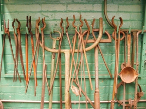
In the casting area, abandoned tools are so rusty that they really do look as if they came right out of an archeological dig, a bitter-sweet still life set against the proverbial institutional green walls.

????

Logos and names tell a story as well. These machines come from all over the world: England, Austria, Canada and the United States, to mention just a few. These machines are giants with intimidating names like “Invicta Major” that speak of national pride, and of a time when Western countries reigned supreme over their manufacturing empires and were thought to be invincible.

DSCF7183 (1280x959)????

????????

????

Today the reality is different. For the first time ever, for a student graduating from a five-year machinist programme, job prospects are declining as manufacturing jobs are leaving North America and relocating overseas. China is now the largest manufacturing country in the world, overtaking the United States only a few years ago.


Sadly and slightly surprisingly, I did not find a South Bend machine in my Van Tech metal shop photos. But stepping back, I see the bigger picture. This shop is a time capsule of a world that we may take for granted, but is surely fading away and may soon disappear. As an instructor teaching Metal Techniques in a Jewellery programme, I do believe in the value of the skills I pass on to the next generation of goldsmiths. But, what will their place and their role be in the new age we are moving into?


PS: For those of you who are not familiar with Stu’s blog, here‘s the link.


Being G. Moffat

1388 title photo copy

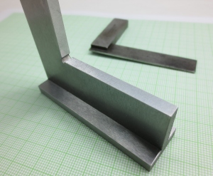
G. Moffat’s set square.

Is there anything more exciting that browsing through a tool catalogue? (Don’t answer that, it was a rhetorical question) Of course, the printed ones are the best kind as you can write on them and put sticky notes on your favorite pages, but I love them all. To me, tool catalogues are fun because tools are synonymous with possibilities.

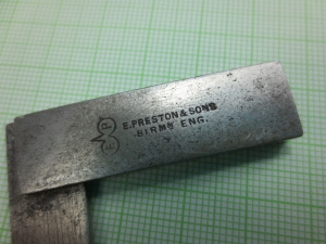
Many years ago, when I was still a jewellery student, I was given an old set square
by a friend. It had been passed on to him when he was apprenticed to a
shipwright, designing and building wooden boats. I’ve always treasured it as a
symbol of our friendship and appreciated its beauty and elegance.

1381 e preston and sons copy (1280x960)1384 G Moffat copy (1280x960)

Its patina and slightly worn edges betray a long working life. And it is intriguing; it has a trademark logo with the letters “E P”, and “E PRESTON & SONS    BIRMM, ENG.” stamped on one side of the body, and on the other, a name, “G. Moffat” engraved in an old-fashioned cursive. The trademark, sometimes called the Bird’s Eye, is from Edward Preston & Sons, a tool manufacturing company that operated from 1825 to 1932 in Birmingham, England; catalogues from the early 1900’s can be found online. As for G. Moffat, I don’t know who he was – a machinist perhaps – but I’ve always felt connected to him, and through him, to the brother/sisterhood of metal workers.

1375 - german set square Copy1374 german set square detail copy (1280x960)

Fast forward a few years. I set up my own studio and gain more experience. I feel I can, with more confidence, set for myself higher standards of precision, and decide I am ready for a brand new made-in-Germany set square. Several years later, it is still as crisp as new and milled to perfection; when ultimate accuracy is required, that’s what I rely on. For goldsmiths, as with machinists, precision is essential, and our measuring tools – and set square – are always within easy reach on top of the bench. When you need a straight edge or a straight angle, or to check for squareness, place the blade of the square against the metal edge and put it in front of a light source. No light should shine through.

1376 both squares copy

But no matter what project I am working on, G. Moffat’s set square is always right in front of me on my bench, next to its German-made pristine, younger counterpart. Yes, its edges are a bit too soft, its surface pitted and worn, but it is smaller and lighter and fits comfortably in my hand. What it may lack in accuracy, it makes up with ergonomics. G. Moffat carefully and proudly engraved his name on his set square; that tells me that he cared for his tools and valued his work. It is a reminder of where I come from, the sum of skills, knowledge and experience accumulated by tradespeople who’ve come before me.

If any of you have stories about tools that are meaningful to you, please share in the comments section.

The Lab

Still from "The Bride of Frankenstein", 1935.

Still from “The Bride of Frankenstein”, 1935.

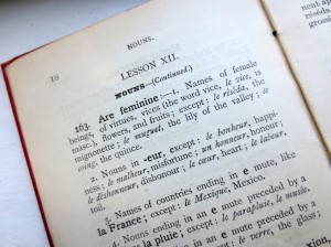
It is funny how naming things can impose a different shade of meaning on how we perceive them. As a native French speaker, I often lament the neutrality of the English language. While, I admit, a gender-neutral language is often more practical and better suited to our modern day society, I find it at times less colourful and poetic. For me it is natural that flowers and cars are feminine, and trees and trucks masculine. And of course everybody will agree that the sun is masculine and the moon, feminine.

Henri Bué, Second French Book, Hachette, Paris, London, Boston, 1893.

Henri Bué, Second French Book, Hachette, Paris, London, Boston, 1893.

In the college where I teach Metal Techniques, our classrooms are called labs – a term I wasn’t comfortable with at first, maybe because it is a somewhat painful reminder of my “bad lab days” in high school when I never amounted to more than a “C” student in chemistry and physics. Up till now I was more partial to “workshop” or “shop”, but after much pondering, I am reconsidering.  The word “shop” conjures up a time not so long ago when most goldsmiths were men. When I think “workshop”, I see cute elves working frantically at their benches while Christmas music is playing in the background. None of that is really a true reflection of who I am and what I do professionally.

Ateliers Fabergé

Fabergé workshop, late 19th century. Photo: Wikimedia Commons

In fact a science lab and a goldsmith’s studio have quite a bit in common, and not just their physical attributes – the workbench or countertop, lots of cabinets and drawers, and a journal or notebook to keep track of the results of the experiments. In my previous post I expressed the need to explore and ask questions in order to reawaken my creativity. In that spirit, seeing my studio as a lab, a place for investigating and exploring, will certainly give me the freedom I need to do just that.

Ultimately, it comes down to the birds and the bees (No, I don’t mean that!). A goldsmith in her “lab” is more inclined to look at other forms of artistic expression, look at other disciplines and see how they might intersect with metalwork and jewellery; play with different materials, draw on a wider range of techniques and try new ones, explore new technologies, try a different hat on, collaborate AND allow for cross-pollination.  I will leave you with a quote by Andy Goldsworthy: “Every so often I feel as birds must before their first migration – a gut instinct that something is wrong where they are, a strong sense that they must now go where they have never been before.”

Andy Goldsworthy Yellow elm leaves laid over a rock low water Dumfreisshire, Scotland, 15 October 1991

Andy Goldsworthy
Yellow elm leaves laid over a rock
low water
Dumfriesshire, Scotland, 15 October 1991

Back to school

Marcel Duchamp, L.H.O.O.Q., 1919 Photo: Wikimedia Commons

Marcel Duchamp, L.H.O.O.Q., 1919
Photo: Wikimedia Commons

September is my favourite month of the year. Yes, the air is crisper, sharper even, as if infused with a sense of purpose that I find invigorating after the lazy days of summer. I have always loved going back to school. For me, the New Year, with all its possibilities, really starts in September, not in January.

This year marks a new beginning as I am starting a new job. Instead of being a travelling instructor working in several schools, I am now “permanently” attached to a college where I teach metal techniques and art history. (Note: I don’t have tenure yet, hence the quotation marks). I have been asked to create a whole new art history curriculum, which is both very exciting and very terrifying. Art history is my first love, but this was a long time ago (in the twentieth century). I have since explored other disciplines: photography, fine arts, and lastly jewellery. So here I am now, on both sides of the desk, so to speak.
Here, in the twenty-first century, art historians are of course asking themselves the same age-old questions, such as: What is art? Why do we make art (or jewellery)? And what does this all mean? But this is also the Digital Age, with the emergence of new technologies, and the ever-present social media. As the making and disseminating of art is transformed dramatically, more questions need to be asked. Should not we take a new look at the art institutions, the museums and the art galleries? Do we still need them? Are they/should they be the only custodians of art? In today’s society, where everything can be turned into a commodity, what it the role of art and artists? And then, there are questions more specific to jewellery-making. With climate change, ethical questions concerning the mining of precious metals and its effects on the environment become even more pressing. So, how does that affect us as makers? And what about new technologies, such as 3-D printing among others, what impact do they have on the production of jewellery? Are traditional metal techniques then still relevant? Will that give designers more freedom to explore, and to push boundaries?

I could go on and on. These are only some of the many questions that any art historian should be pondering and that any art history teacher should be asking her students.

Well, barely two weeks into the school year, I realize that I haven’t done enough of that myself, as a goldsmith – the asking and questioning. I hope I can be forgiven, after maintaining a studio and running a jewellery business for so many years, for becoming maybe a bit complacent and forgetting that increasing your customer base or growing your sales should not be the primary goal of an artist.

So I am full of anticipation as I go back to school and begin a new year. I hope that this new job will give me the freedom to keep exploring and asking questions. Here is a quote from “Ways of Seeing”, a series of essays on art criticism by John Berger, a classic that should be on the reading list of any art history student – or teacher, or artist.

“The relation between what we see and what we know is never settled. Each evening we see the sun set. We know that the earth is turning away from it. Yet the knowledge, the explanation, never quite fits the sight.”

― John Berger, Ways of Seeing, 1972, BBC & Penguin Books

My first school.

My first school.

Alchemist’s Travel Kit – Update

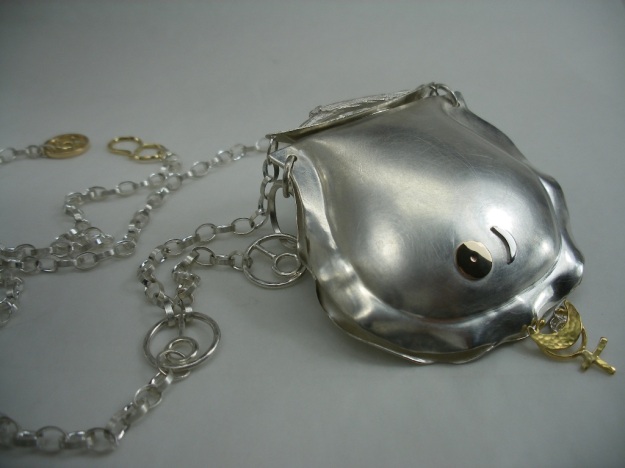
Dominique Bréchault - Alchemist's Travel Kit - Locket with chain.

Dominique Bréchault – Alchemist’s Travel Kit – Locket with chain.

In a previous post, I related the fabrication process of “Alchemist’s Travel Kit”, a locket I intended to submit to an exhibition. It was a long process involving several metalworking techniques, like die-forming, a technique I also described in that post.

I was under a lot of stress, trying not only to finish the piece, but gathering as well all the material and information needed for the submission, and all this, under a fast-approaching deadline. In the end, everything worked out: the piece was finished, the photos shot, the statement written on time… and my piece was accepted!

This juried exhibition called “Circle Craft – 40 years and Beyond” is a group show featuring 45 members of Circle Craft Cooperative in celebration of its 40th anniversary. Here is an excerpt of the Media Release: This show marks an important anniversary, a recognition of the past, but…is also a show about the future. Forty years ago, Circle Craft Cooperative was formed in Victoria, BC to support the viability and growth of craft in British Columbia. A measure of its success can be seen in the works created by today’s members, works that push the boundaries of “the applied arts”.

I have been a proud member Of Circle Craft since 1998, and I am thrilled to be part of this show.

The exhibition takes place August 6-23 at the Pendulum Gallery, HSBC Building, 885 West Georgia, in Vancouver.

Dominique Bréchault - Alchemist's Travel Kit. Locket. Sterling silver, 18k & 14k gold, patina. Fabricated. die-formed, cast, stamped, fused. (Shown with lid closed)

Dominique Bréchault – Alchemist’s Travel Kit. Locket. Sterling silver, 18k & 14k gold, patina. Fabricated. die-formed, cast, stamped, fused. (Shown with lid closed)

Dominique Bréchault - Alchemist's Travel Kit. Locket. (Shown with lid open)

Dominique Bréchault – Alchemist’s Travel Kit. Locket. (Shown with lid open)

How to Wrap Five Eggs: a designer’s must-have

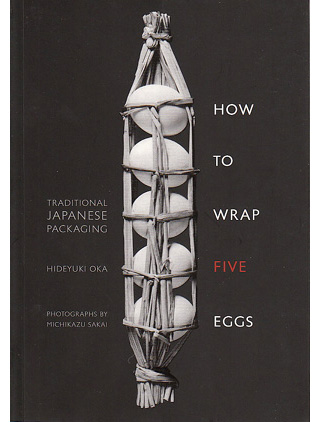
How to Wrap Five Eggs - Traditional Japanese Packaging, by Hideyuki Oka. Photographs by Michikazu Sakai.

How to Wrap Five Eggs – Traditional Japanese Packaging, by Hideyuki Oka. Photographs by Michikazu Sakai.

For years, I lugged around a dog-eared copy of “How to Wrap Five Eggs”, a coffee-table size book from my local library. Knowing that it was both out of print and unaffordable, I made dozens of drawings from the gorgeous black and white illustrations so that I could revisit them and mine them for ideas later (until I had received too many angry reminders from the library, and had to reluctantly return the book). I found everything I was looking for, and much more: timeless designs, both practical and beautiful.

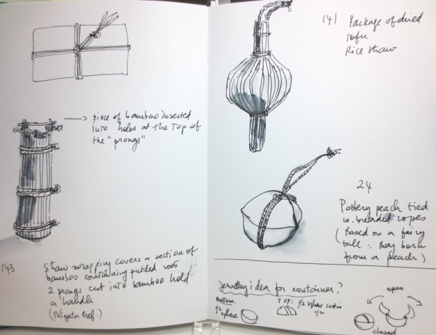
Drawings based on How to Wrap Five Eggs.

My sketchbook. Drawings based on How to Wrap Five Eggs.

Hideyuki Oka (1905-1995), a renowned Japanese graphic designer, collected traditional Japanese packaging and his collections were regularly exhibited around the world. A book featuring over 200 traditional objects from his collection, with illustrations by Michikazu Sakai, and commentaries by Oka, was published in 1967. A second edition came out in 1975 under the title “How to Wrap Five More Eggs”. These are pricey, oversized books, with gorgeous black and white photographs, that, as I said, are unfortunately out of print. However, in 2008, Shambhala Publications reissued the second book inexplicably under the title of the first book “How to Wrap Five Eggs”. As a paperback, it is now quite affordable, and also, thankfully, much easier to lug around!

When searching for inspiration and new ideas, I always prefer to look at other mediums. By avoiding jewellery, I am more likely to come up with less predictable, fresher ideas. Also, I find that most design solutions can be translated from one medium to another. This book is an excellent tool for the design process. It shows what makes a “good” design – a balanced relationship between beauty and function.

Drawing based on How to Wrap Five Eggs page 137

Drawing based on How to Wrap Five Eggs, p 137.

(Above) A package of dried tofu slices made of rice straw. It reminds me of the lavender potpourris my grandmother would make every year at the end of the summer. The bundle of long-stemmed flowers was tied tightly together, then bent onto itself to keep the flowers on the inside. A silk ribbon was threaded through to keep it from breaking and spilling its contents on the linens. Simple, but effective.

Drawing 2 (185-186) 160-161

Drawing based on How to Wrap Five Eggs, p 160-161

(Above) Tofu and “mochi” (steamed rice) pounded into cakes and strung with rice straw. Can be hung from the ceiling and used as needed. Ordinary, everyday products are beautifully and elegantly packaged. The strong graphic lines of the straw create a very pleasing rhythmical pattern.

Drawing based on How to Wrap Five Eggs, p 138-139

Drawing based on How to Wrap Five Eggs, p 138-139.

(Above) Basic packages made from natural materials and designed to carry, store and preserve various food items. Palm leaf, and a sheath of straw.

Drawing based on How to Wrap Five Eggs, p 150.

Drawing based on How to Wrap Five Eggs, p 150.

(Above) Sampling of food from a restaurant in Tokyo wrapped in an unadorned package – except for the elaborate knots of the straw rope. This was meant to be given as a gift. It is quite understated, but done with great care and consideration. According to Oka, “What is the use of a package if it shows no feeling?”

Drawing based on How to Wrap Five Eggs, p 138.

Drawing based on How to Wrap Five Eggs, p 138.

(Above) A section of bamboo covered with straw, used as a container for pickled roots of mountain burdock. Rustic looking, but its shape is perfectly suited for the long roots of burdock. The handle is a small piece of bamboo inserted into holes pierced into two prongs protruding from the bamboo tube – a simple, but elegant solution that could be easily translated into metal.

Drawing after How to Wrap Five Eggs, p 35.

Drawing based on How to Wrap Five Eggs, p 35.

(Above) Container for candies, from Okayama Prefecture. Pottery in the shape of a peach tied with braided ropes. The design is based on the fairy tale of Momotaro, the boy born from a peach. The bottom part of the container is a half-sphere; the top is made of two domed sections. This is another design that could be adapted to metalwork, for a small locket or a larger scale vessel, with a lid articulated on hinges.

What I have presented in this post is a small sampling of what can be found in Oka’s book. In this selection, I chose to focus mostly on simple packages made with everyday natural materials, whatever was at hand, like straw, leaves and bamboo. “How to Wrap Five Eggs” offers many more examples of wrappers, boxes, baskets and various containers, some more intricate or less rustic, and using clay, paper, wood or fabric. Regardless of the choice of materials, no matter how humble they might be, the craftsmanship is always exquisite; whatever the technique (ceramics, wood carving, basketry, etc.), every piece shows a careful attention for the simplest of details, as well as ingenuity and creativity. These are valuable lessons on how to apply smart, elegant solutions to design challenges; timeless in that they can still be applied today, even with modern materials.

I will leave you with one final quote by Hideyuki Oka : “… what we have lost for sure is what this book is about: a once-common sense of fitness in the relationships between hand, material, use, and shape, and above all, a sense of delight in the look and feel of very ordinary, humble things.”

“How to Wrap Five Eggs – Traditional Japanese Packaging”

By Hideyuki Oka. Photographs by Michikazu Sakai. Weatherhill, an imprint of Shamhala Publications, Inc., 2008. ISBN 978-1-59030-619-2